Philanthropies Website
Gift Planning Update
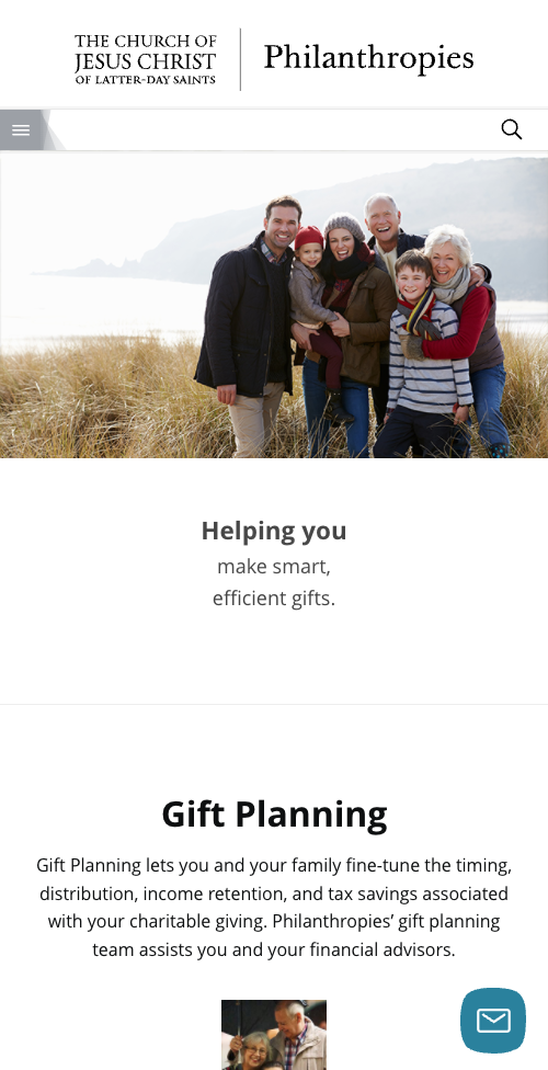
The gift planning section of the Philanthropies website is enormous, containing information ranging from how to donate stocks and other assets to specific planned giving tools. The main gift planning page needed a big update to best highlight the most popular and necessary information to make it easy to access.
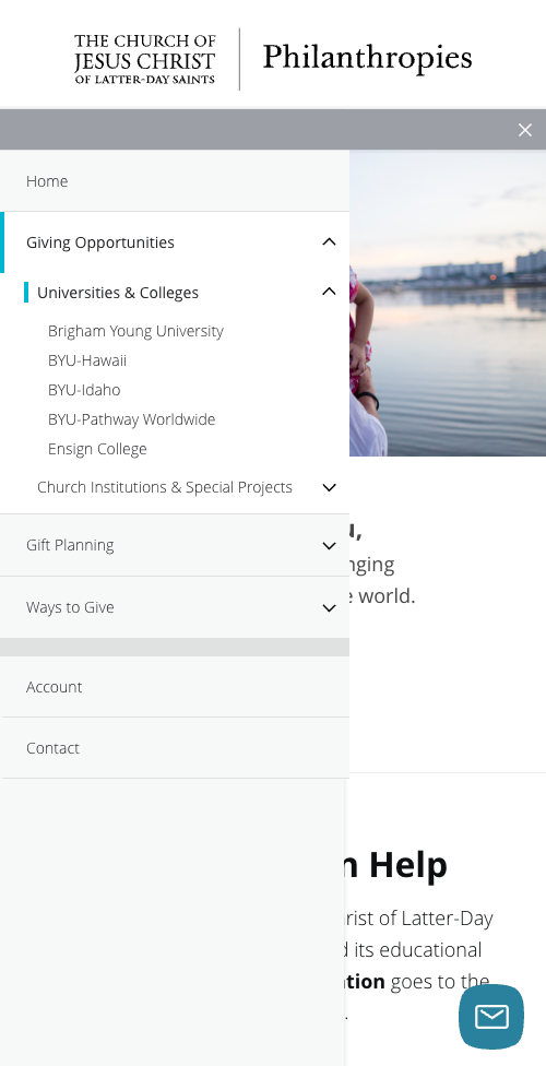
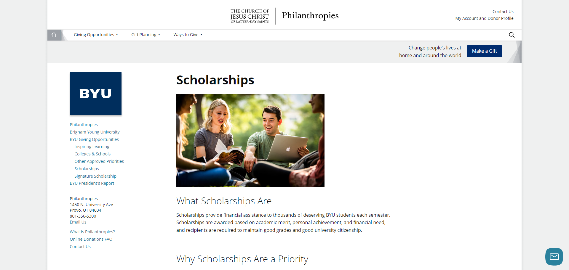
Another part of this large update was to make sure it was easy to navigate the many pages of information, especially once the user drilled down into specific categories. The side menu was updated with clearer headings, linking to the most popular pages as well as pages that have relevant information to the user’s current page, and a breadcrumb navigation was added to make navigation easier.
The general layout was updated to make the content-heavy pages with clear headings and new line illustrations that I designed, with the goal of making these pages easier to read through to find the information the user is looking for.
Mega Menu
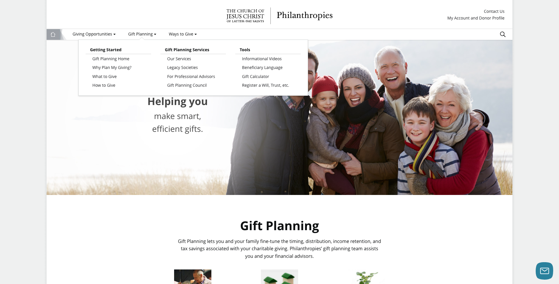
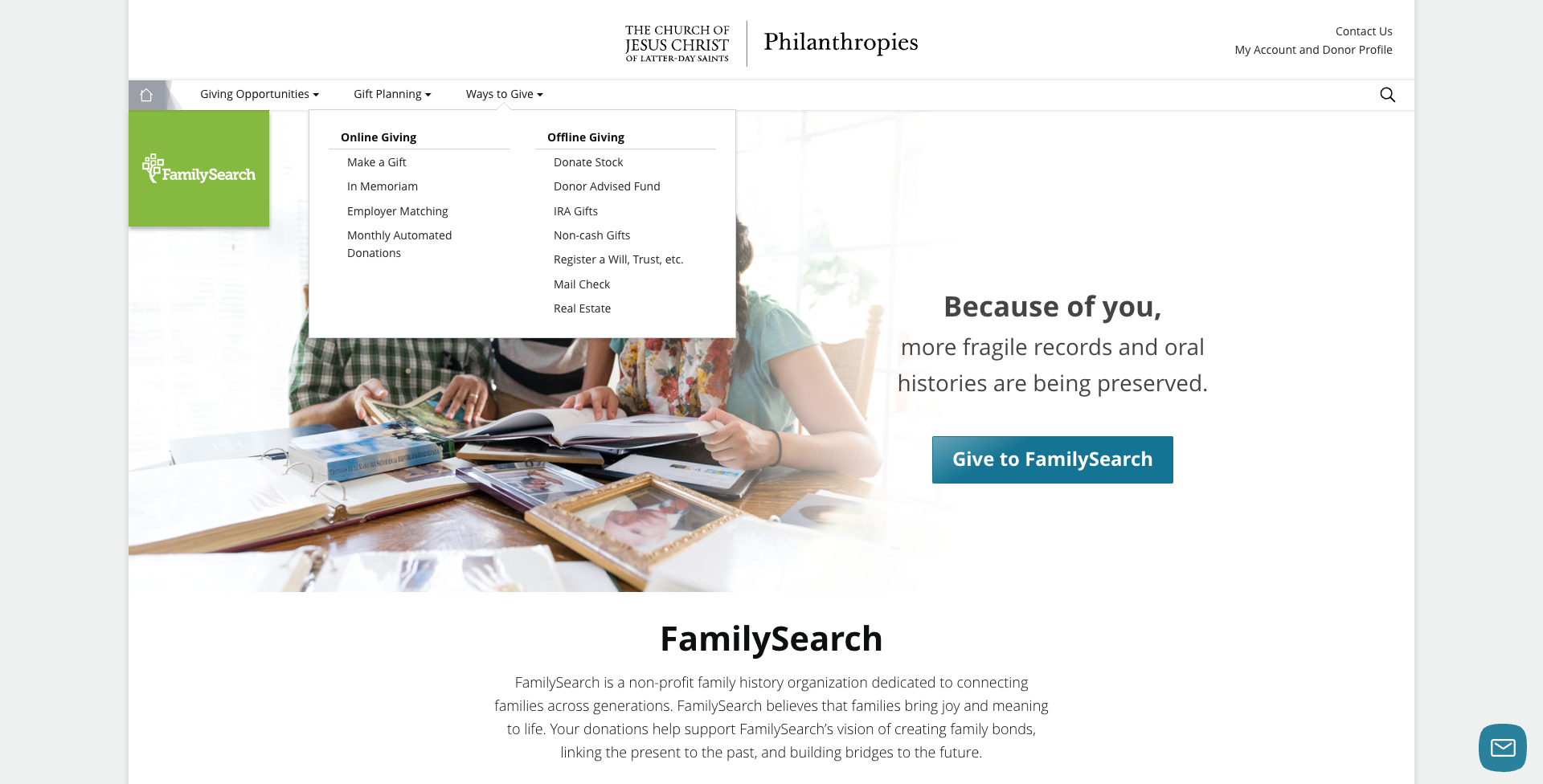
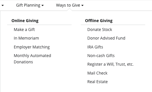
At the same time I was working on updating the gift planning section of the site, I tackled the navigation as well. Initially, each option was a simple dropdown menu, but once the gift planning project was underway, I realized we needed a better way to display all the information to make it easier for users to find what they’re looking for.
The “Gift Planning” dropdown received an overhaul, with the pages being reorganized, prioritizing the ones that visitors use most frequently. I also made sure to clearly label high level pages that lead to more specific information. The “Giving Opportunities” and “Ways to Give” only needed clarified headings and layouts.
This was all first planned in Figma for both desktop and mobile layouts, then built using HTML5 and SASS, as well as some JavaScript.
Combining Church Styling with School Branding
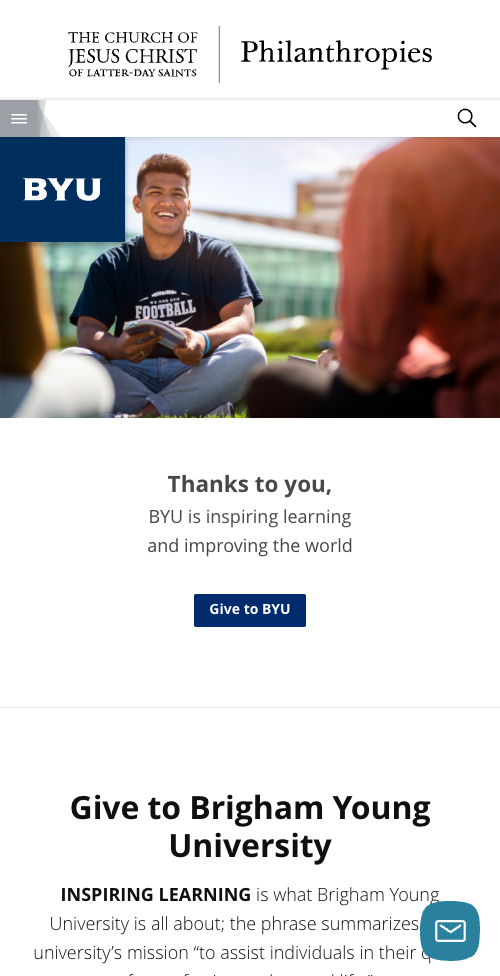
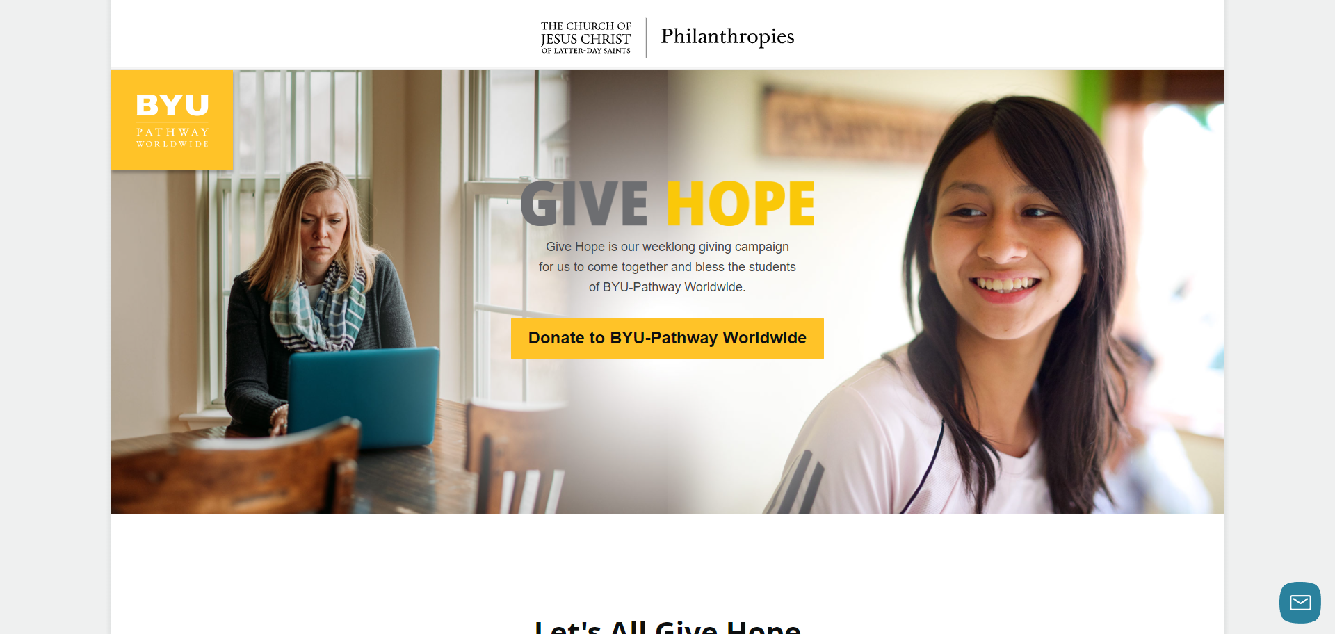
One particular challenge with the Philanthropies website is the requirement to use Church styling across the site, including on university pages that have different branding. We were required to use the same header on these university pages with the Church’s logo, so I needed to find a way to include university branding alongside Church styling.
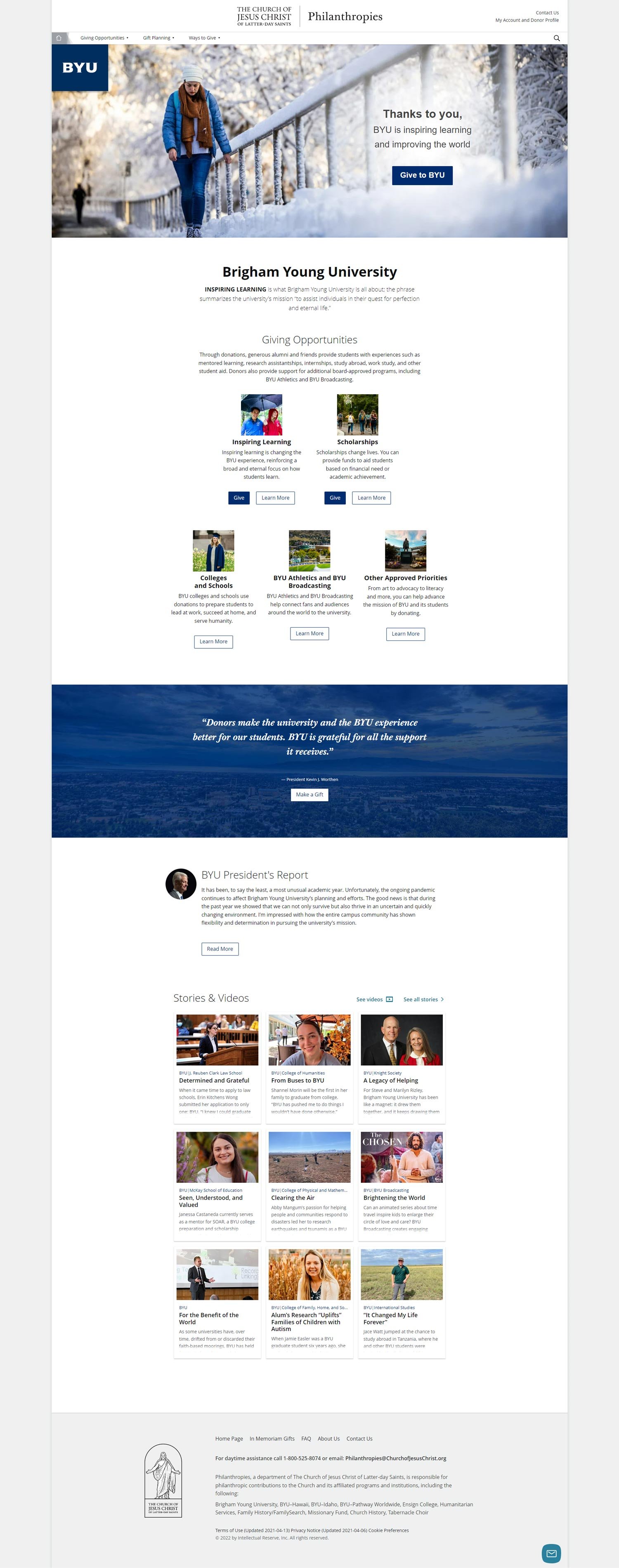
The first solution was what I call the branding square. On each of the university home pages, the logo set on the school color is included in the top left of the hero image. On the subpages, the branding square was inserted into the side navigation to ensure branding is present on each university page.
The second solution was to use school colors wherever possible. This includes the branding square, buttons, and background images with overlays. I also used a gray accent color in the navigation to make sure there weren’t any clashing colors.
Updating School Pages
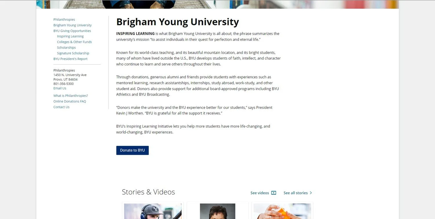
For a long time, the content on the university pages was a block of text with a list of scholarships, colleges and departments, and other priorities to donate to, followed by a simple donation button. On the left side was a side navigation that led to different subpages.
This wall of text made it difficult to discern where to find more information about the selection of giving opportunities that were available, on top of being simply boring and visually uninteresting.
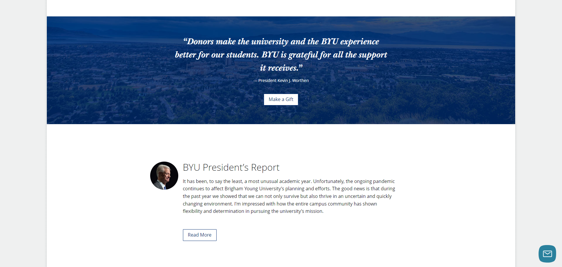
To fix this, I added icons with quick blurbs explaining giving priorities, a call-to-action section with a bold background to catch attention, and an excerpt from the latest message from the university’s president. Making sure all the content from the side navigation was present and accessible on the page allowed me to remove it while making the page as a whole much more visually appealing.

